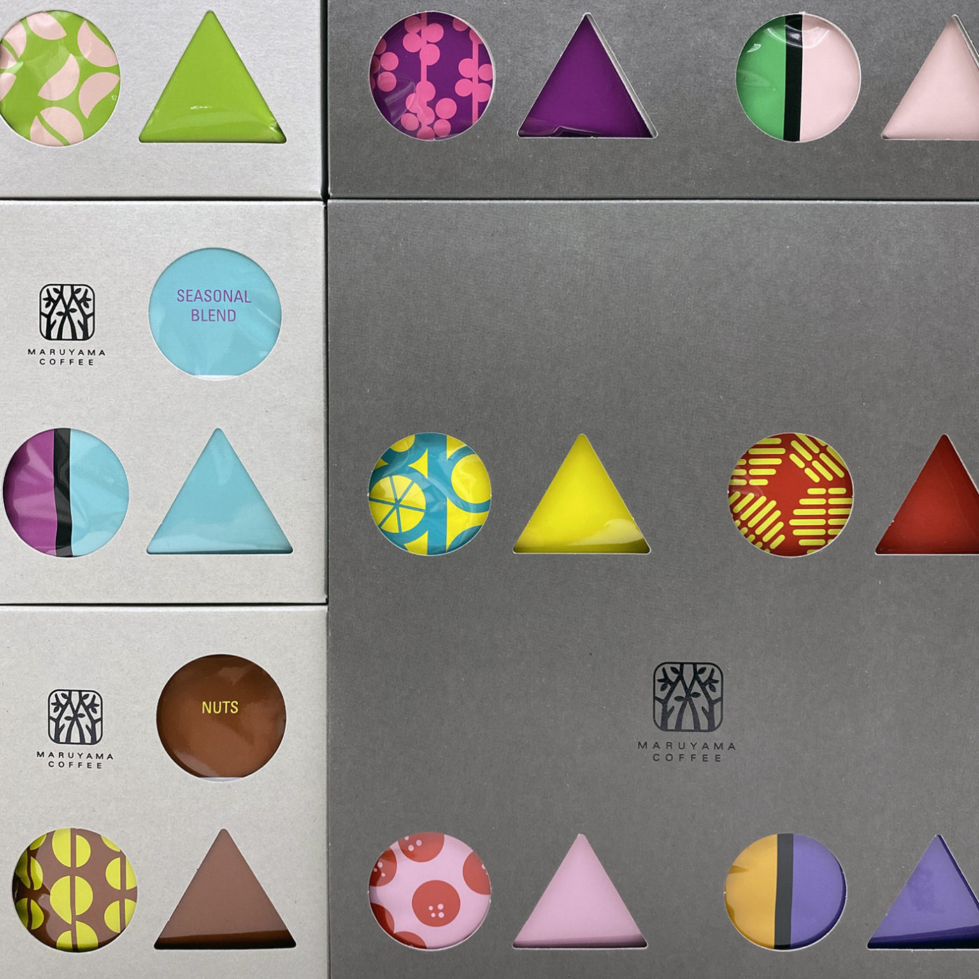
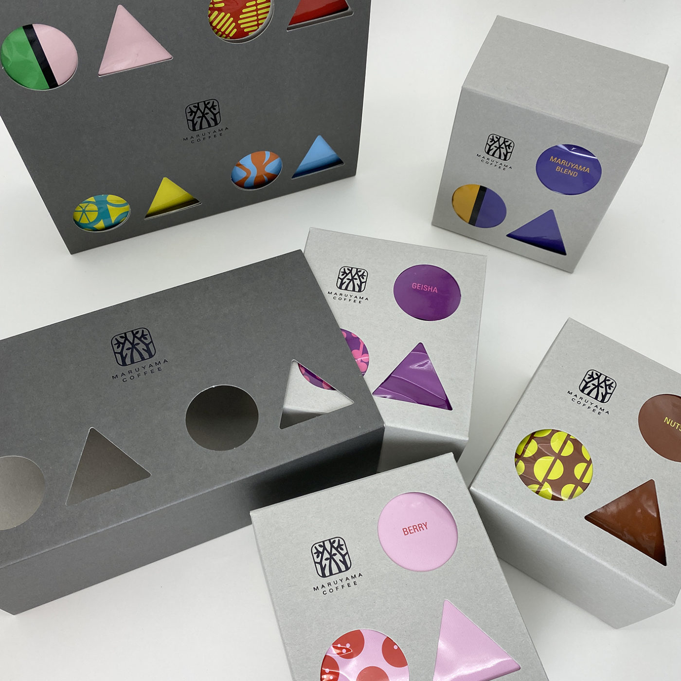
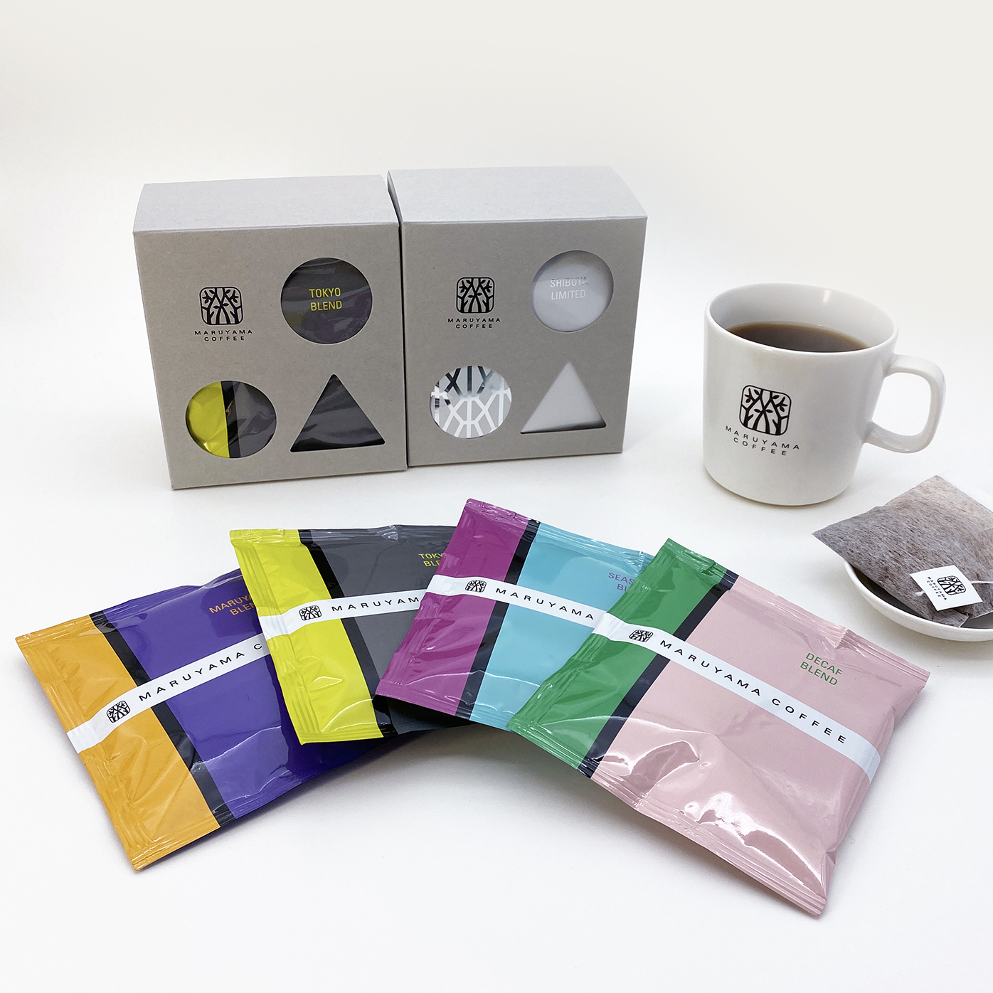
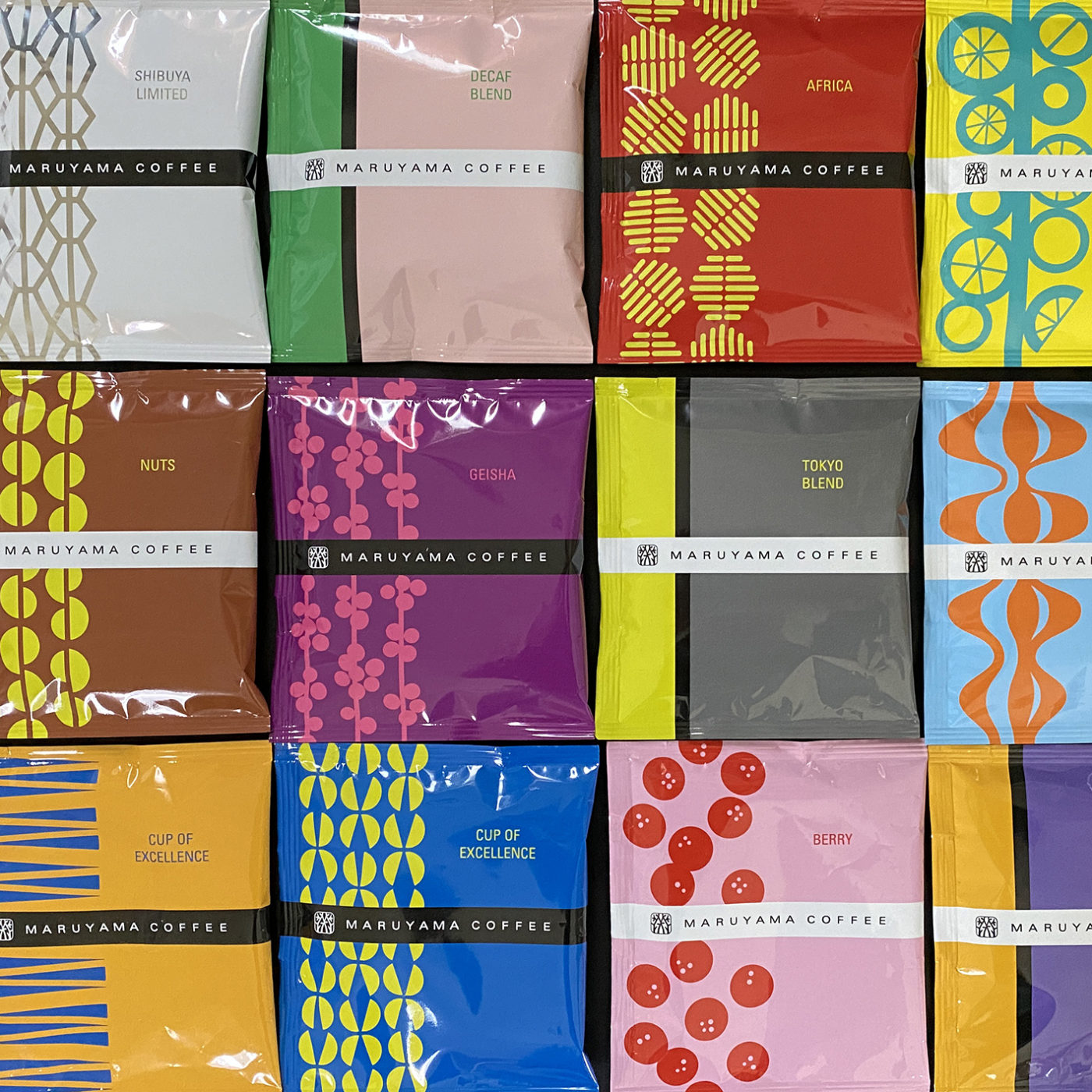
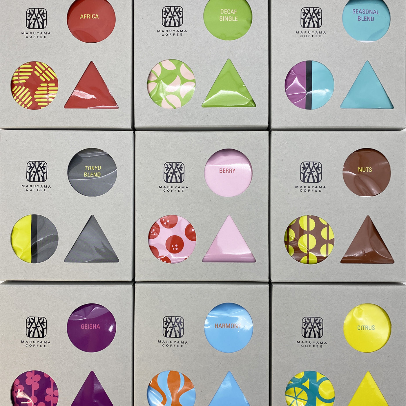
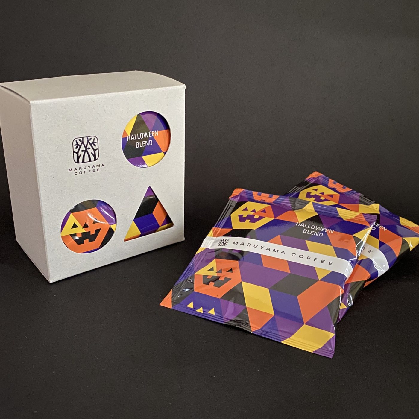
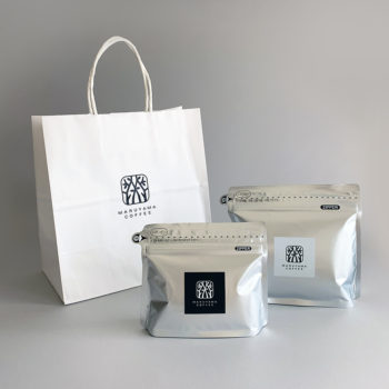
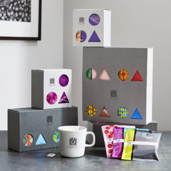
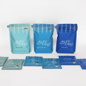
丸山珈琲さんのコーヒーバッグのパッケージ。コーヒー初心者の人たちにも気軽に楽しく飲んでいただきたく、◯と△の形にあいたグレーの窓の紙箱から明るくカラフルなグラフィックをのぞかせて、店頭で新しい風が吹くようにポップにデザインしました。◯と△の形の意味は「マルとヤマ」「豆に関わるヒトの形や珈琲産地のヤマの形」。袋のデザインは基本的にコーヒー豆をモチーフに、各フレーバーのイメージをビジュアル化しました。ブレンド用のシンプルな縦ラインのデザインは、箱にセットした時に左下の丸窓と重なると「○に縦の線の入った豆」にみえるようにしています。リーフレットの表紙の◯△◯の色は、豆が熟成していく過程のイメージカラーです。
This package, specially designed for Maruyama’s new line of coffee bags, displays bright and colorful graphics through round and triangle windows, providing a fun and easy way to enjoy coffee, even for beginners. ○ and △ shapes signify circle and mountain, which translate to “maru” and “yama” in Japanese. They also represent bean growers, forming a person when combined, as well as the mountain where coffee farms are located, in the shape of a triangle. Motifs on the bags are essentially designed based on coffee beans and portray the image of each flavor. A simple vertical line on the bag for blended coffee depicts the crack of a bean so that what shows through the lower-left round window, when the bag is set in the gray box, looks like a coffee bean. Colors of ○△○ on the leaflet cover convey how shades change as coffee beans mature.