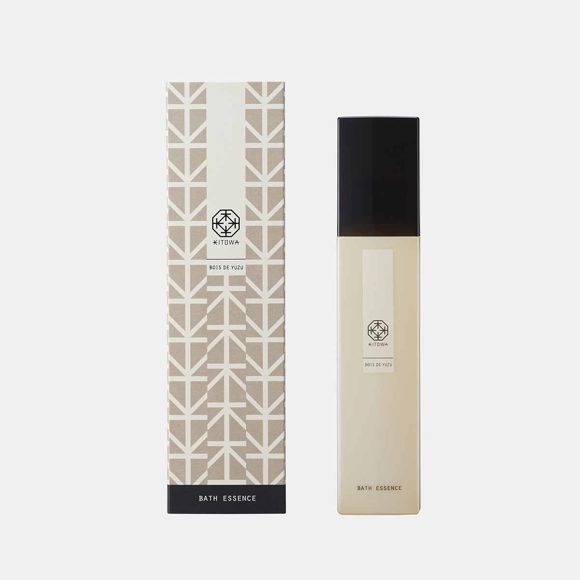
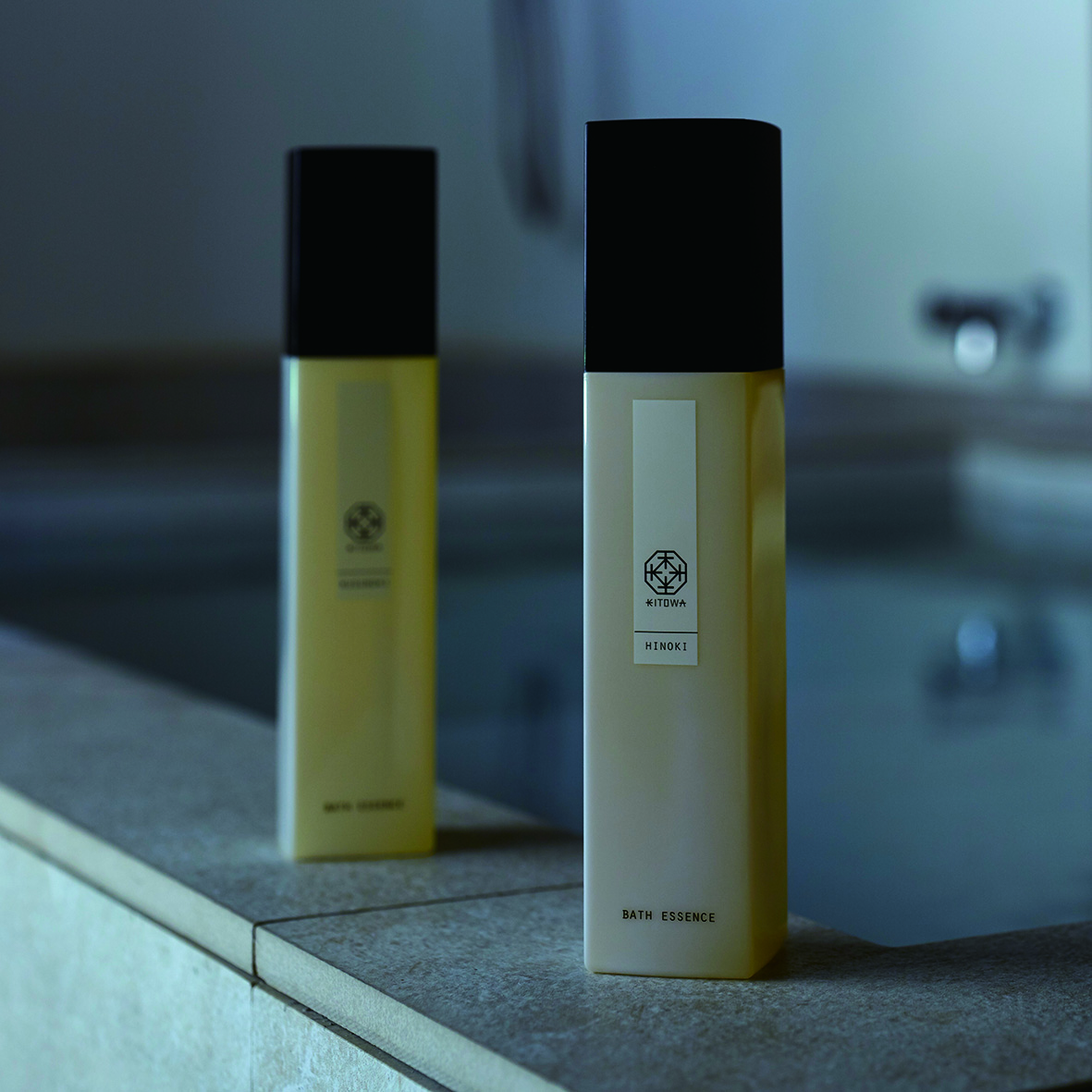
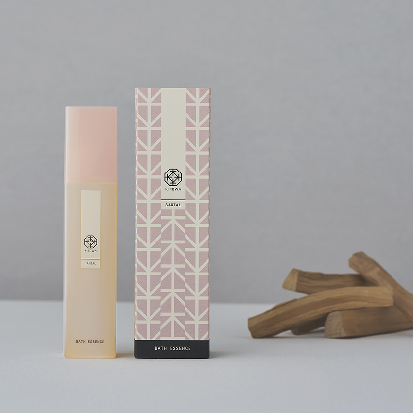
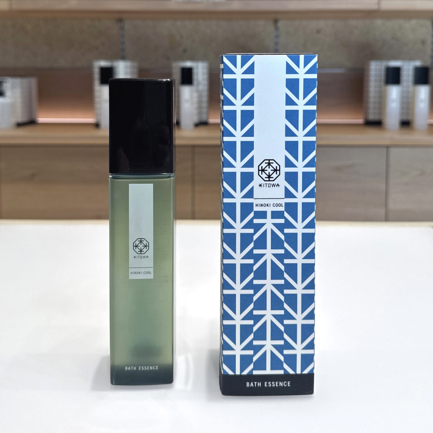
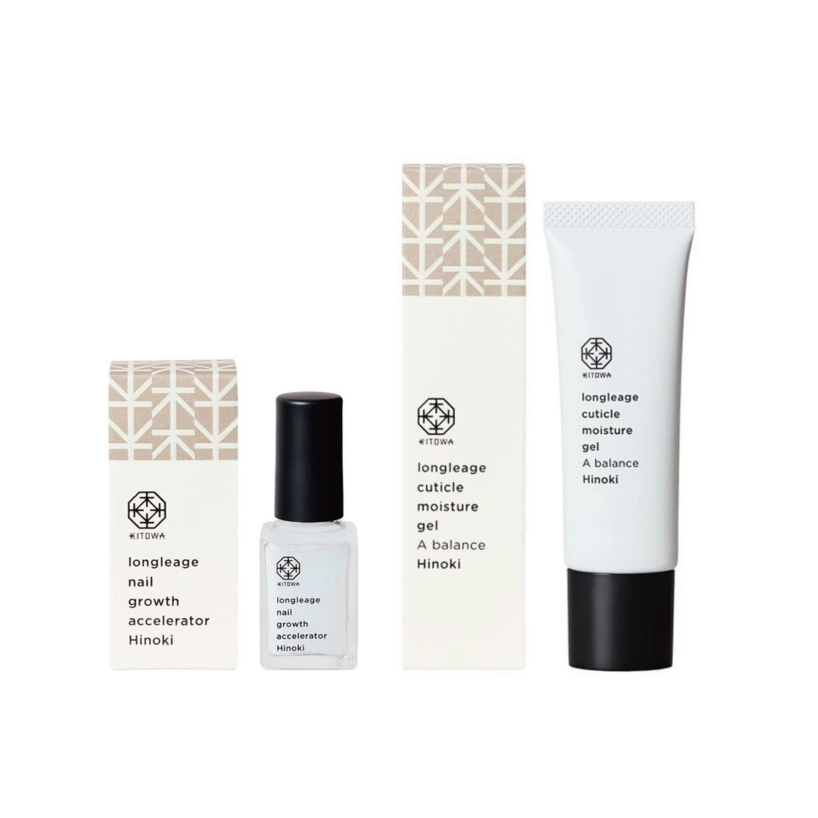
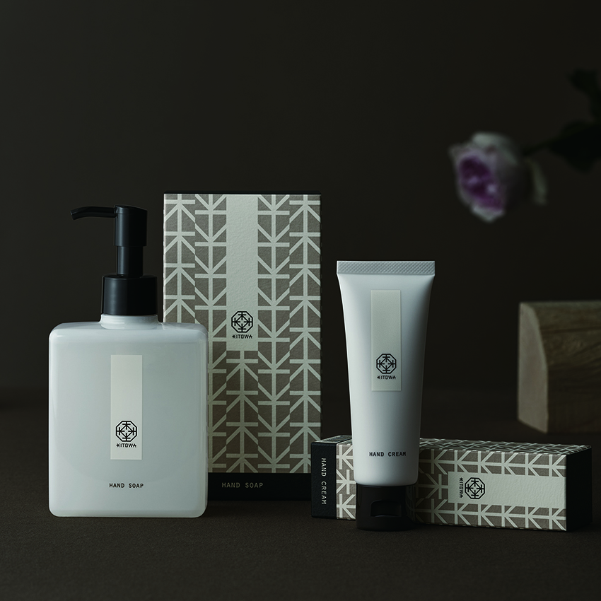
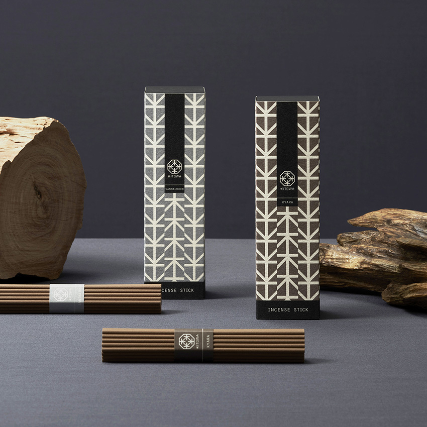
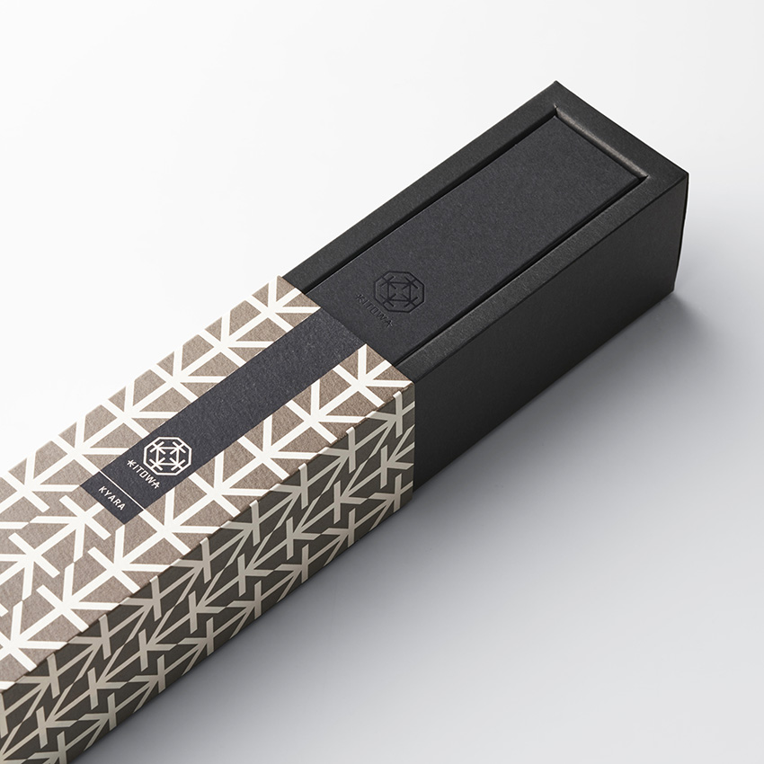
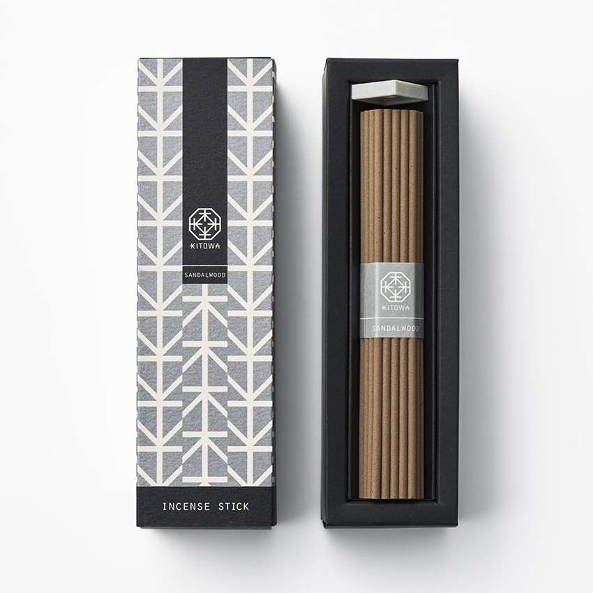
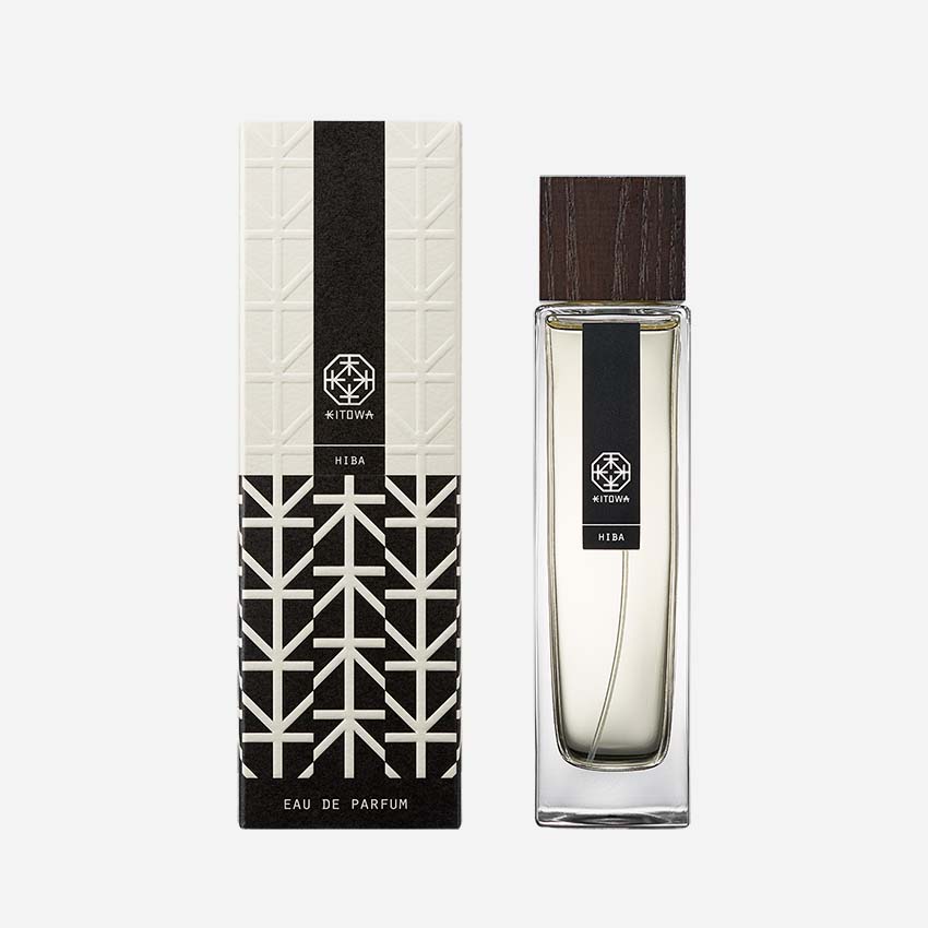
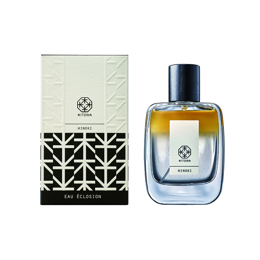
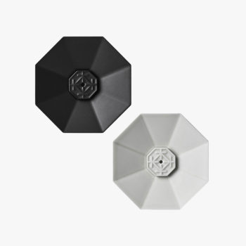
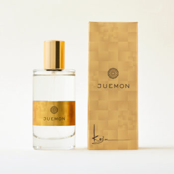
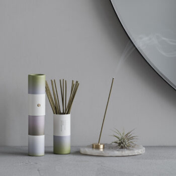
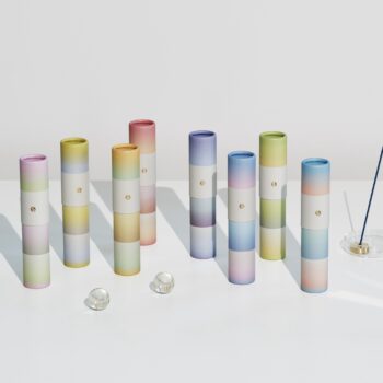
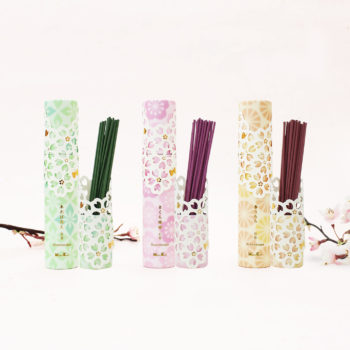
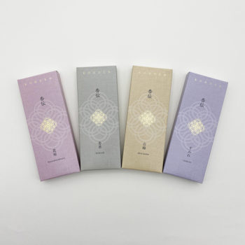
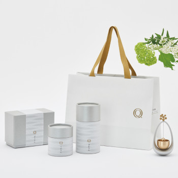
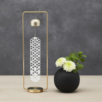
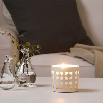
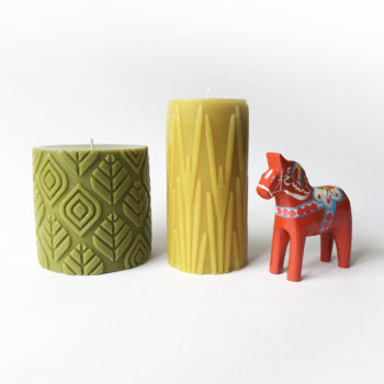
和木のオイルをベースとした高級ファインフレグランスのブランド「KITOWA」のロゴやパッケージ、プロダクトなどのデザインをしています。
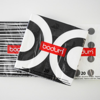
中世的で凛とした落ち着いた香りの世界をモノクロの世界で表現し、漢字の「木」とアルファベットの「K」の文字の連続柄で、日本の木造建築的な雰囲気をだしていますが、
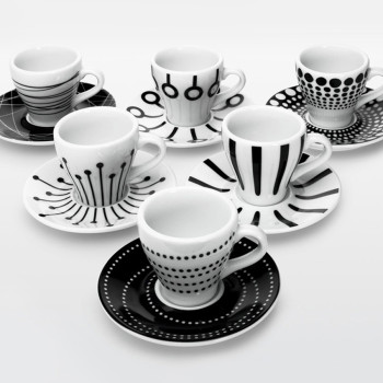
新アイテムの発売やいろいろな方々のコラボによる機会ごとに、パッケージは日々更新しています。
Design the logo, packaging, and products for KITOWA, a premium fine fragrance brand based on Japanese wood oil.
Express its medieval, dignified, and serene scent world through monochrome visuals, using a continuous pattern of the kanji character “KI” (tree) and the letter “K” to evoke the essence of Japanese wooden architecture.
However, the packaging is updated daily for each new product launch and collaborative opportunity with various partners.
product design(diffuser, incense holder, candle holder etc.) logo, package, leaflet design: Miya Suwa