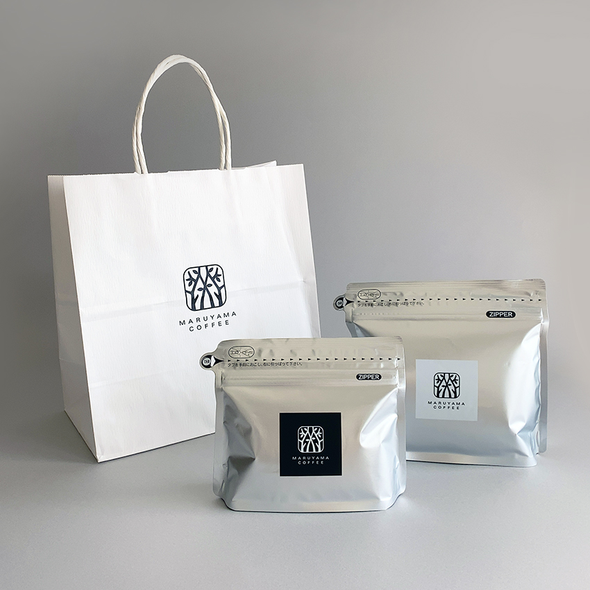
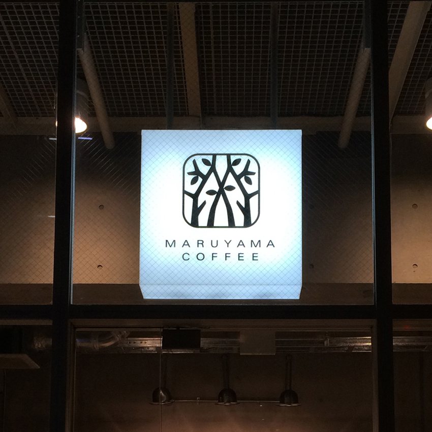
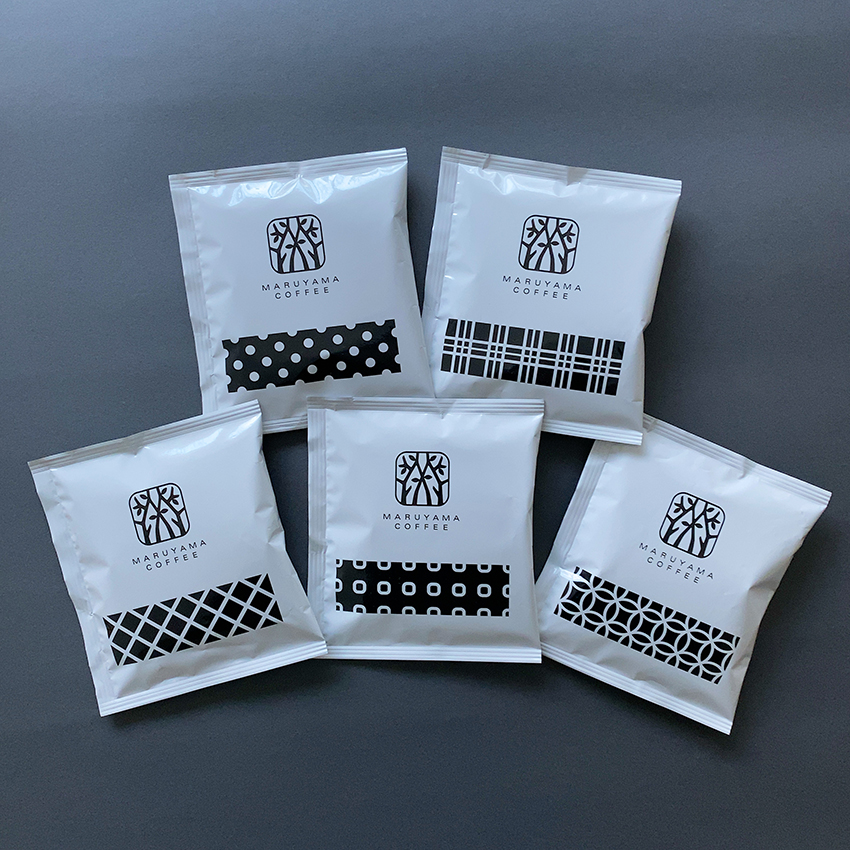
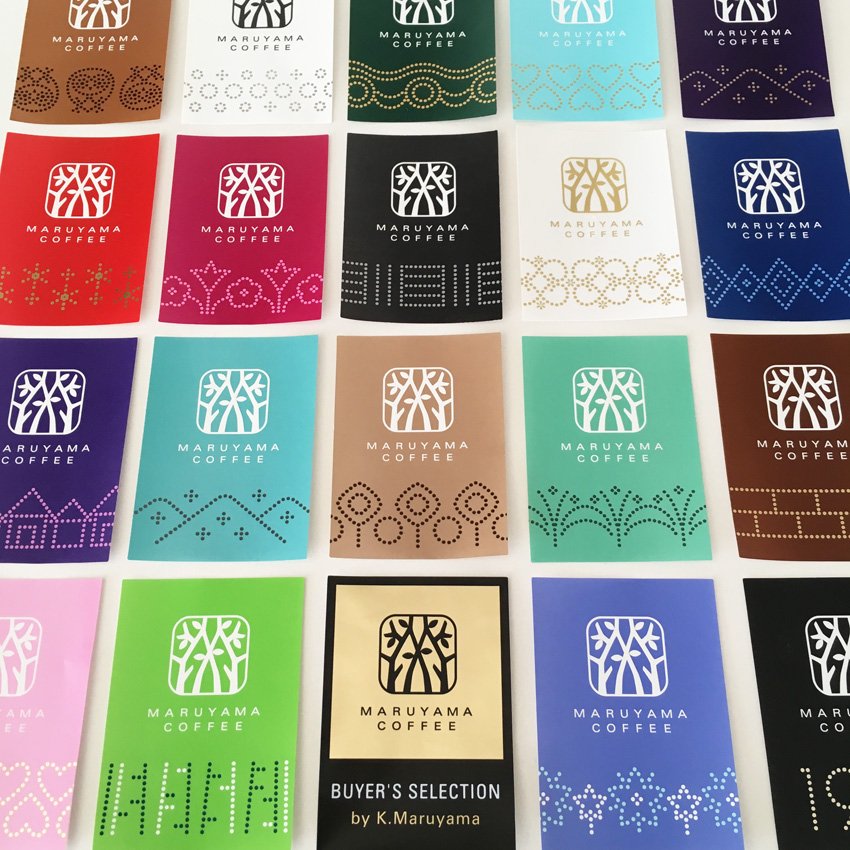
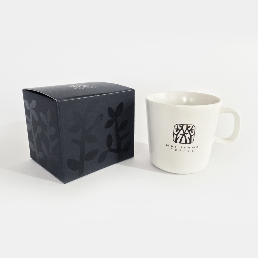
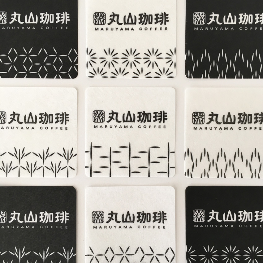
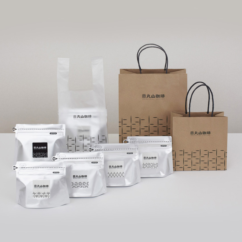
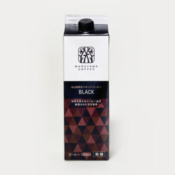
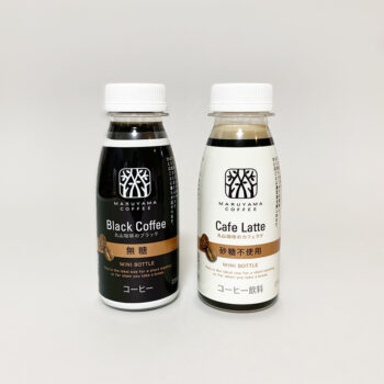
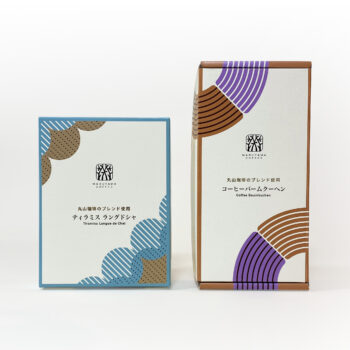
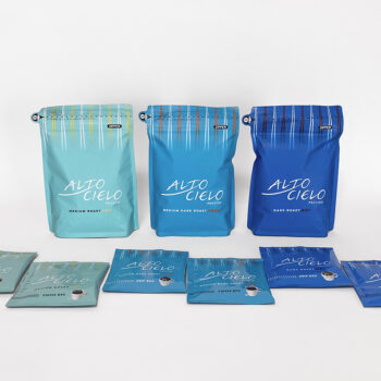
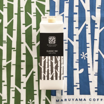
軽井沢の森の一軒家からはじまった丸山珈琲さん。木漏れ日の中にある家の形を、丸山さんの頭文字”M”の文字で表現。袋やラベルにも白樺や四季の柄を配し、静かで落ち着きのある空気感をもたせました。2014年からは国際的なご活躍を願って、ロゴを英語表示のみにし、パッケージもシンプルに刷新しました。
MARUYAMA COFFEE started off in a house in the woods of Karuizawa, Nagano. The logo represents this house with trees in the shape of an M from Maruyama. Bags and labels were designed with patterns of white birch and seasonal motifs symbolic of this tranquil town. From 2014, considering international expansion, only English is used on the logo, with packages renovated for simpler style.