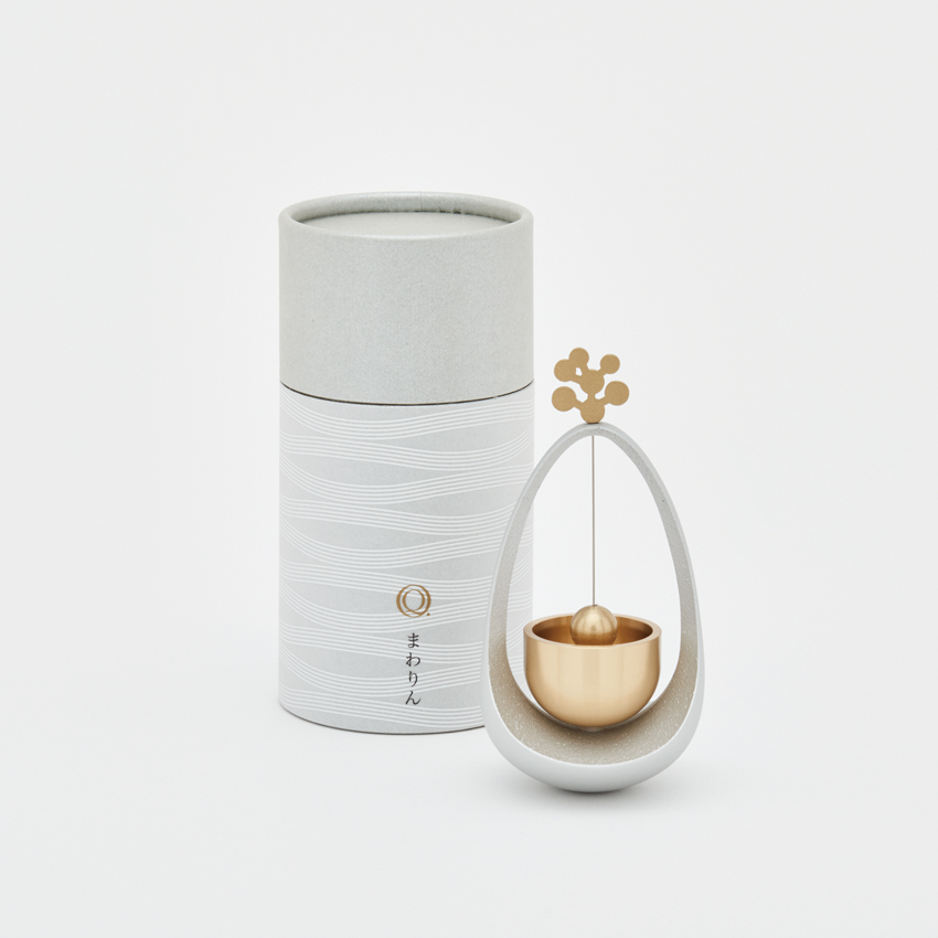
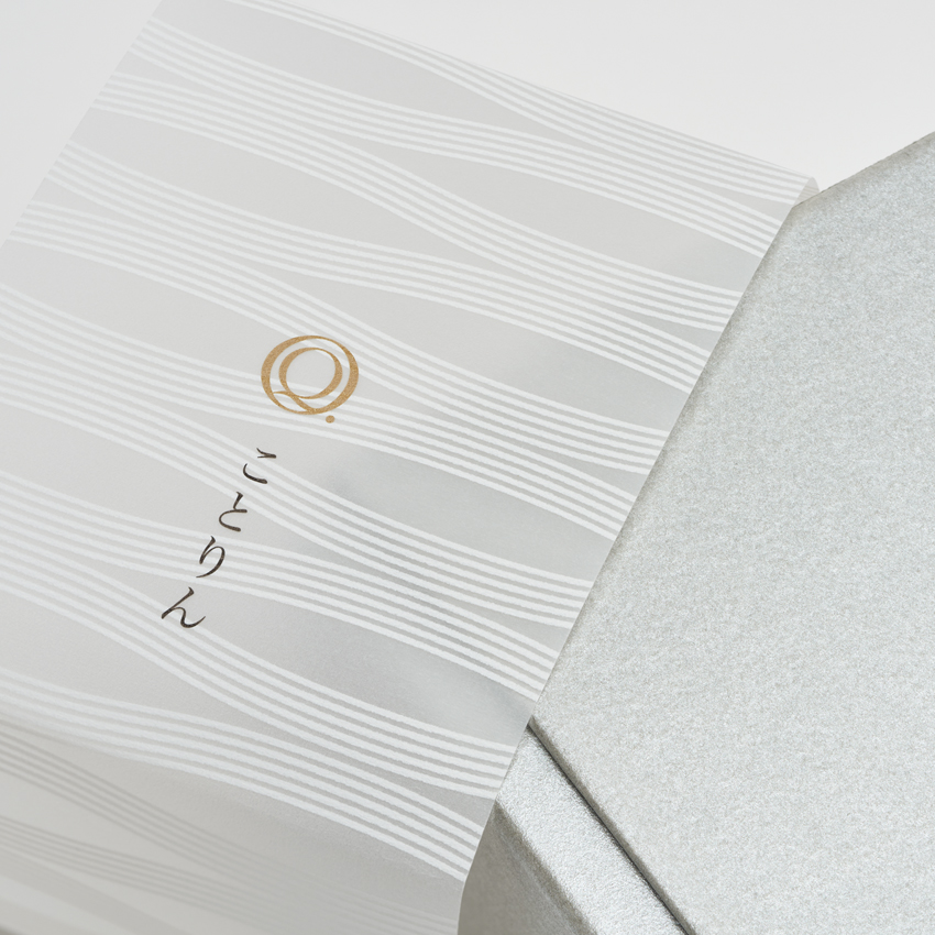
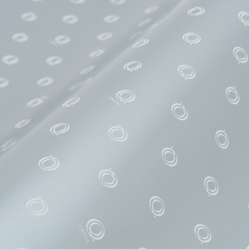
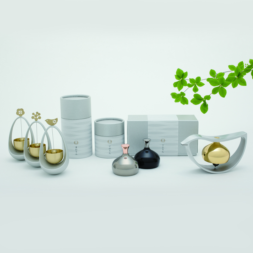
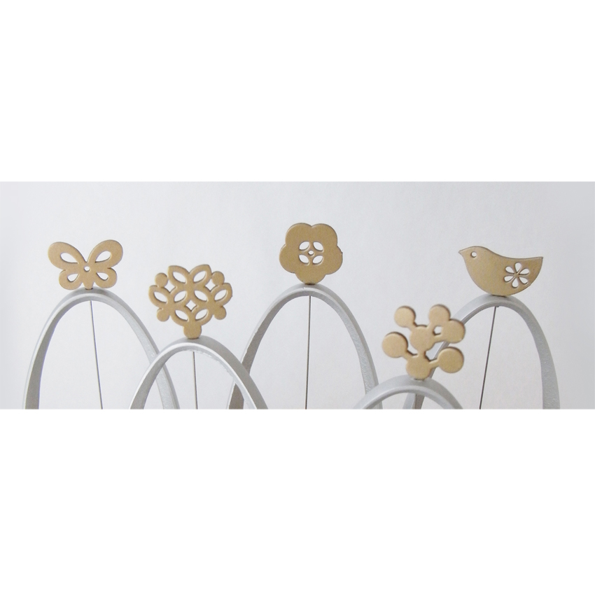
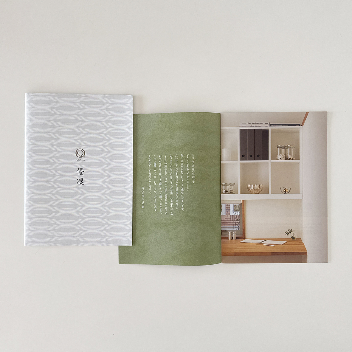
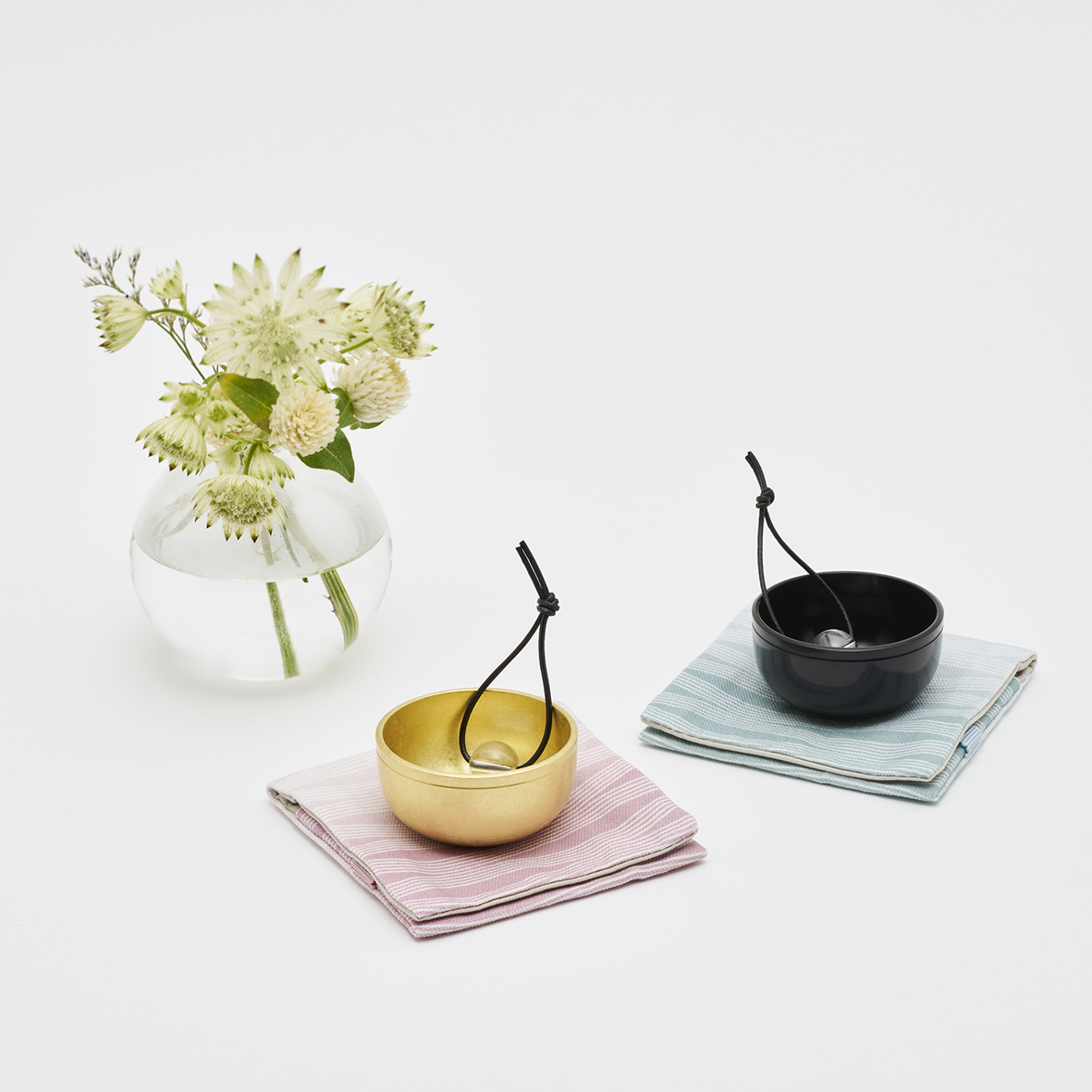
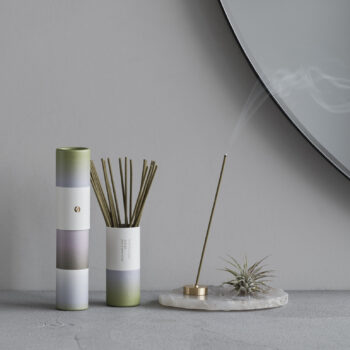
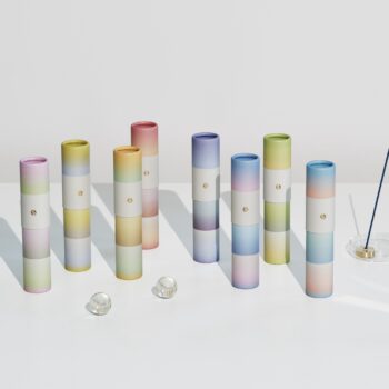
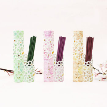
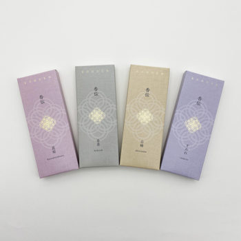
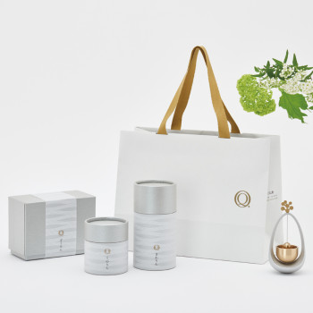
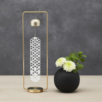
本来仏具として使われていたおりんをインテリア向けにブランディングした「優凛」シリーズです。パッケージやカタログにデザインした波模様は五線譜とたゆたう音のイメージを、商品についてはおりんの飾り部分のみデザインをして、可愛らしさをだすようにしています。リーフレットの写真のディレクションは発売以来ずっと行っています。
パッケージはTopawards Asiaを受賞しました。https://www.topawardsasia.com/winners/kyujo-orin-yurin
The “Yurin” series rebrands traditional Buddhist orin bells as interior decor items. The wave patterns designed for packaging and catalogs evoke musical staves and the image of rippling sound. For the products themselves, only the decorative parts of the orin bells were designed to emphasize their charm. I have directed the photography for the leaflets since the series launched.
Topawards Winner’s Package: https://www.topawardsasia.com/winners/kyujo-orin-yurin